Over the course of the past few months I walked through a rebranding project with Drop Cap Design that took me down a really unexpected road to assessing not only what I believe about who I am, but what I believe about creativity in general. Previous to walking through this process , I was pretty naive to what all goes into branding. I knew that there would be a dinstinct process, but was unaware of how personal it was until Kadie sent me one of the most detailed series of questions I have ever had to answer about myself and my business. I found myself uncertain of a lot of important things - so much so that I had to ask her if we could postpone the actual design process at one point so that I could really take some time to consider why I was struggling so much to find answers to questions that should have come very naturally. I assumed that there was a simple fix - I would just do a bit of self reflection, remind myself how I'm wired & everything would fall into place, but it didn't. I spent hours reading, looking back through old notes from my time with Staff Retreat Co., digging up my Strength Finders test from 2008, and studying a ton about the evolution of our culture as it pertains to our identity - particularly in relationship to creativity.
What I realized in the process of trying to figure out why this project left me feeling paralyzed, is that there was a disconnect in who I actually am and what my existing brand represented. I had this fear about just owning how God created me & then surrendering control of perception. Even more than that, I wasn't creating from a place of confidence in who I am, I was creating for the purpose of affirmation & glory - not the Lord's, but my own.
This project became a bit of a personal exercise in honesty. For the first time, I answered questions without curating my response based on how someone else might perceive me. Kadie took the time to listen, hear my insecurities & fears, encourage me & then create something based on exactly who I am & what I want this little company to represent. The result is something that I am incredibly grateful for, and proud to call my own!
Often times, companies will launch a rebrand, but never actually share what went into it - the thought behind it, the inspiration for it, or the process of getting there. I believe that the heart and soul of a brand is seen in that in-between process, so I wanted to take the time to give you guys a window into what inspired each part of the design.
Enjoy!
-B
INSPIRATION
Over the past year, I fell in love with small, intimate, destination weddings. My first true experience in this space was for a client who's wedding I photographed last December in Australia. It was everything I had ever dreamed of - a multi day event with their closest friends and family that was focused on celebrating their marriage & the relationships that meant the most to them. Every detail, every conversation, & every moment was given tremendous thought and care. There were three words that I felt best represented that experience & ultimately what I want every wedding I photograph to be: intimate, intentional, & powerful.
Collectively the images below represent the direction that I am working towards, but individually they each have purpose & meaning that helped shape the direction of the brand.

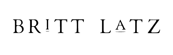
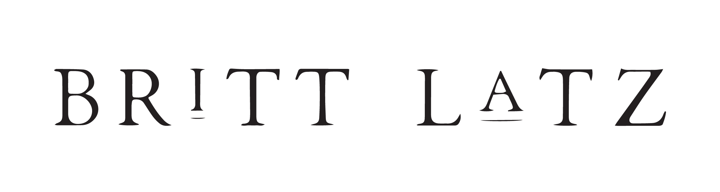
PRIMARY LOGO
I have always been drawn to the classic but distinct typeface used in old books. If you drop me in a book store, I will always go to the little glass case in the corner with the oldest, and most valuable books - not because I enjoy reading (I actually don't at all), but because I love to look at the design/type of books that were not mass produced, but instead they were created on a typewriter - where every single letter was given thought & purpose.
Simultaneously, I love a modern element to design that makes you stop & look twice, but combining the two felt a bit risky. My concern was that it might be confusing, but Kadie managed to flawlessly bring the mess in my head to life by hand drawing this logo - creating a distinct typeface that felt both timeless & contemporary without being obscure.
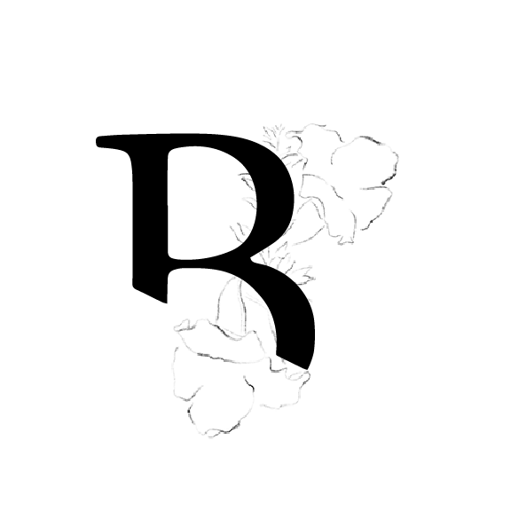
Illustrations


When we were brainstorming about the illustrative element of this project, I was almost immediately drawn back to an excerpt from a book I had read a few years ago that left a powerful impression on me - enough so that I knew immediately I wanted something that possessed the qualities of the cactus.
"The Almighty conceived the cactus plant.... It has humility but it is not submissive. It grows where no other plant will grow. It does not complain when the sun bakes its back, or the wind tears it from the cliff or drowns it in the dry sand of the desert, or when it is thirsty. When the rains come it stores water for the hard times to come. In good times, and in bad, it will still flower. It protects itself against danger, but it harms no other plant. It adapts itself perfectly to almost any environment. It is the plant of patience and solitude, love and madness, ugliness and beauty, toughness and gentleness. Of all plants, surely God made the cactus in His own image." - The Power of One, Bryce Courtenay
We decided to use the Desert Willow as the primary source of inspiration for the illustrations as it carried the strong qualities of the cactus, while also being delicate & feminine. I wanted something that balanced the strong design & colors, and the hand drawn illustrations were exactly what I had hoped for!
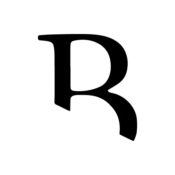
MONOGRAM
SECONDARY LOGOS

COLOR & texture
I've always been inspired by the colors of nature - particularly the ocean. There is something fascinating about a vast, untamable force possessing colors that make you linger. I don't think it's ironic that the ocean reflects the qualities of The Creator - powerful beyond what we can imagine, yet the place we find the most rest. I knew that going into this process I wanted the same feelings to be evoked by the colors & texture we chose - strong & yet inviting.

If you are considering a branding project, I would encourage you to reach out to Drop Cap Design & simply start a conversation. There is so much more that goes into building a brand identity than just a pretty design. This process was invaluable for both my company & me personally. I couldn't have done it without Kadie's patience, encouragement & willingness to ask the tough questions. You pour your life into building a business, so make sure you are building something that accurately represents who you are! If you have any questions about my experience through this process, or why I decided to invest in rebranding, I am more than happy to give any insight I can - just drop me a line at hello@brittlatz.com!